Designed and built the attribute, tag, and SEO system that organized the catalog and worked around UX the plugin couldn't fix
Connects to
Part 1 — where structure became the band-aid for problems the editor couldn't fully solve
Honest scope
I don't have sales or traffic records from this period, and I'm not going to invent them. This is a systems and information-architecture story, not an outcomes story. What it shows is how I think about structure.
Context
By the time the editor was reliable (Part 1), the platform had a different problem: it was sprawling. Around 467 products — dozens of sign types, banner sizes, fundraiser templates, edge-lit lightboxes, each with its own size and side variations — and almost no organizing logic underneath them.
Categories were inconsistent. Tags were ad hoc. Many products had placeholder descriptions. Search and filtering barely worked because the data they ran on wasn't structured. A catalog that big without a spine isn't just untidy — it's hard to navigate, hard to search, and hard to maintain.
And some of that navigation burden was a direct consequence of the UX limits I'd documented in Part 1: there were editor and filtering problems the plugin simply couldn't be made to solve. Where I couldn't fix the interface, I could at least make the data underneath it work harder.
The shipped product flow — a three-step wizard (Choose Your Sign / Template / Specs) layered on top of the catalog I had to organize.
My role & constraints
I was the only person doing this. No content team, no SEO specialist — I learned the attribute, tag, and Yoast systems deeply enough to build the whole organizing layer myself.
The hard constraint shaped the whole effort: I was building structure on top of a customizer I couldn't re-architect. The Fancy Product Designer plugin bound each product to its template and variations in a fixed way. I couldn't change how the editor worked. What I could control was the metadata layer — categories, attributes, tags, descriptions, and SEO fields — and how coherently it described the catalog. So that's where I worked.
Process
1. Mapping the sprawl
The first job was just seeing the whole thing. The catalog ran to hundreds of products spread across a deep category tree — custom signs, banners, fundraisers, templates, each subdividing into sizes and orientations.
The backend I inherited and had to rationalize — hundreds of design assets and categories, each needing consistent structure.
Seeing the counts laid out — 226 templates alone, dozens of size-specific sub-categories — was what made the scale of the IA problem concrete.
2. Standardizing attributes and tags
Attributes (size, sides, orientation) and tags (occasion, audience, use-case) were the levers that made the catalog filterable. I standardized them so the same concept was described the same way everywhere — so "Business" and "Sales Event" meant the same thing on every product that carried them, and so size and side variations were consistent across product types.
The structured metadata layer I built — consistent categories, tags, and meta across the catalog so filtering and search had real data to run on.
This is the unglamorous core of the work: making a few hundred products describe themselves in a consistent vocabulary so the navigation built on top of them could actually function.
The customer-facing asset taxonomy ("What's the Occasion?") — the same vocabulary discipline, surfaced inside the editor.A content gap I flagged: the upload panel still carried placeholder copy where real instructions needed to be.
3. SEO as organizing discipline, not growth hacking
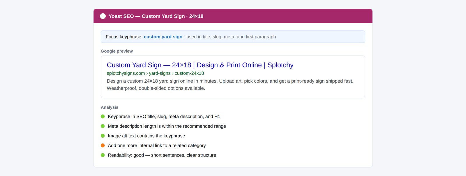
I built out the Yoast SEO layer per product — focus keyphrases, readable descriptions replacing placeholder text, and clean Google-preview snippets.
The per-product SEO panel — focus keyphrase, Google preview, readability.
Per-product SEO — not a growth campaign, but the discipline that forced every product to describe itself clearly.
I'll be straight about this: I have no evidence the SEO work moved traffic or sales, and I won't claim it did. Its real value was organizational. Writing a focus keyphrase and a real description for each product forced a decision about what that product was and who it was for — which fed straight back into the categories and tags. The SEO pass was, in practice, the mechanism that made me rationalize the whole catalog.
4. Using structure to band-aid the UX
This is the part I'm proudest of, because it's where the two case studies connect. Some of the UX problems from Part 1 couldn't be fully fixed in the plugin. The filtering was clumsy; certain editor behaviors couldn't be changed. Where I couldn't fix the interface, I used the data layer to soften the impact: tighter categories and consistent tags meant customers could find the right product faster and arrive at the editor already pointed at the right template and variation, reducing the number of ways they could fall into the broken paths.
It wasn't a true fix — it was a deliberate, honest band-aid. Knowing the difference, and being clear about it, is the point.
Outcome
467 products
Given structured metadata, categories, attributes, and SEO fields
Per-product SEO
Focus keyphrase, snippet, and readability on every listing
Findable catalog
A sprawling product list given a searchable spine
The catalog went from a sprawl of inconsistently-described products to a structured system with a consistent vocabulary, real descriptions, and filtering that ran on clean data. I can't attach a metric to it, and I won't pretend to. What it produced was a maintainable, navigable catalog and a deep working knowledge of how attribute, tag, and SEO systems hold an e-commerce platform together — knowledge that fed directly into the enterprise platform that followed.
Reflection
This work taught me the difference between fixing a problem and managing it. The honest version of my role here is that I couldn't solve every UX issue at the source, so I built the strongest possible structure around the ones I couldn't — and I stayed clear-eyed about which was which. I'd rather show a reviewer that judgment than dress a band-aid up as a cure. It also taught me that information architecture is invisible when it works: nobody notices a well-organized catalog, they just find what they need.