A consistent client relationship across recurring events and program materials — three years of a Women's Christmas Dinner series, plus seasonal art-program collateral.
Three consecutive years of the Women's Christmas Dinner — each year a fresh identity that still reads as the same recurring event.
A consistent client relationship across recurring events and program materials.
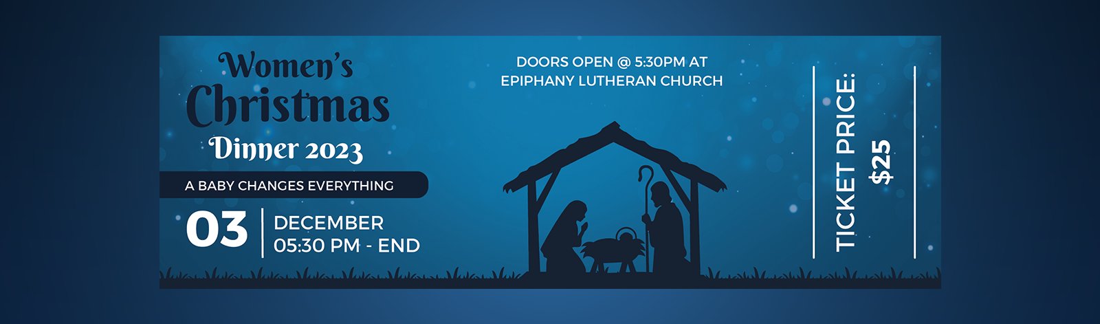
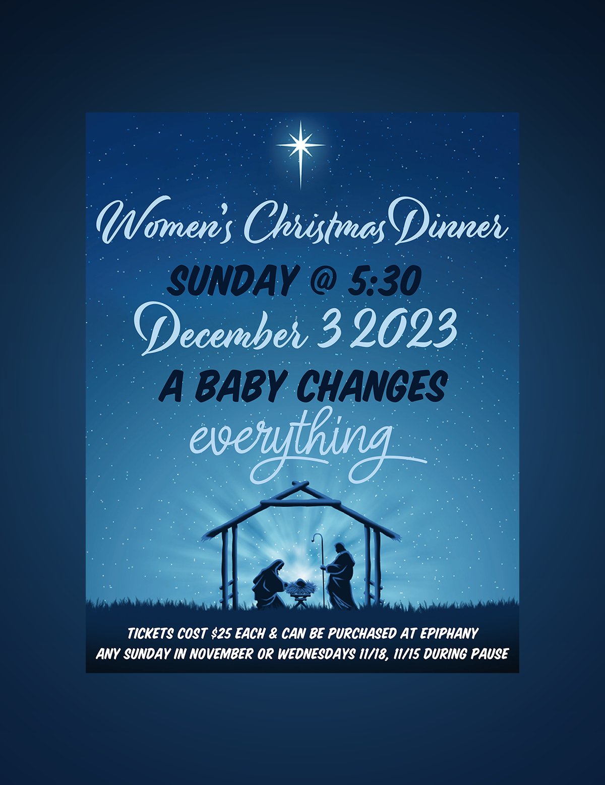
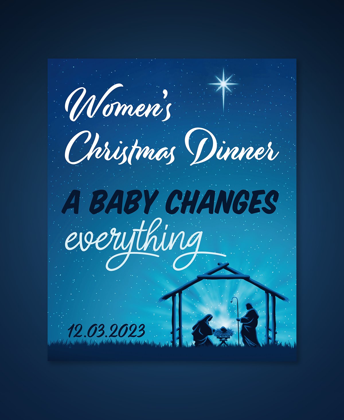
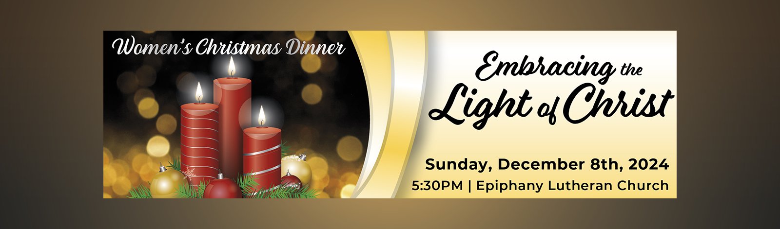
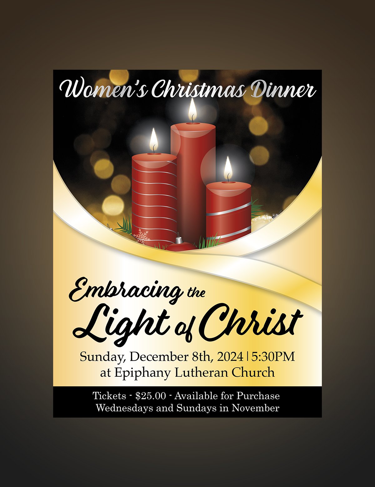
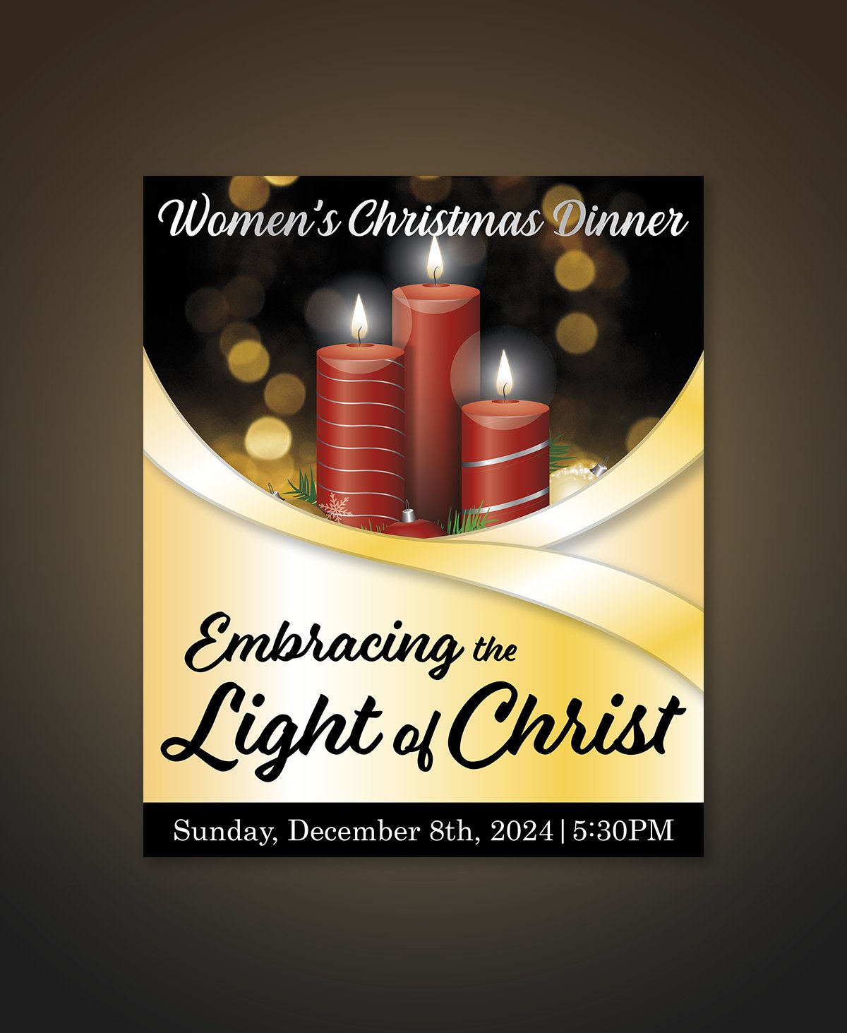
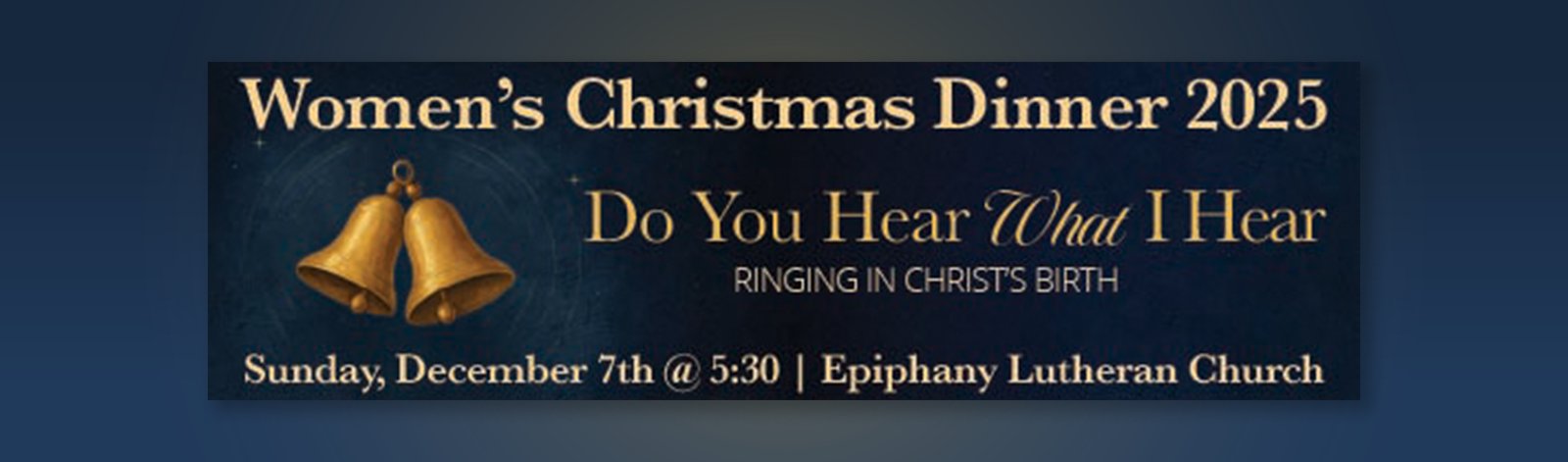
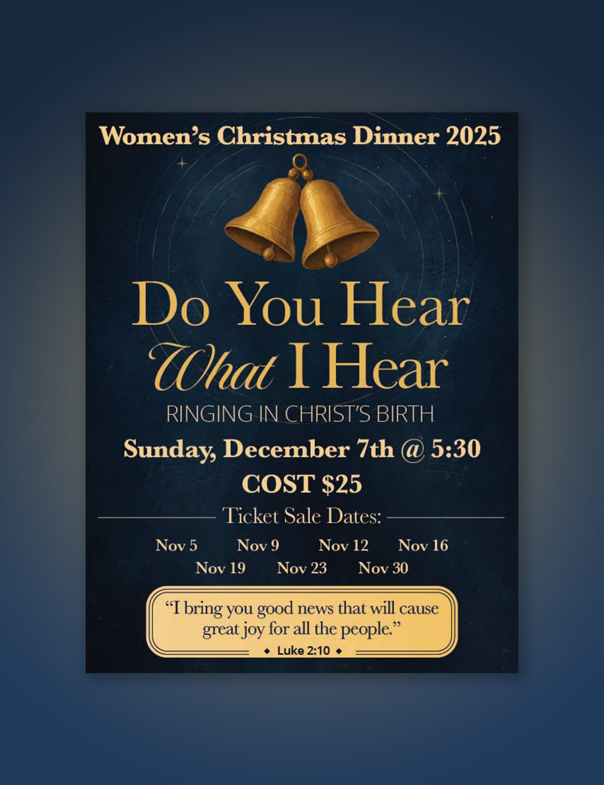
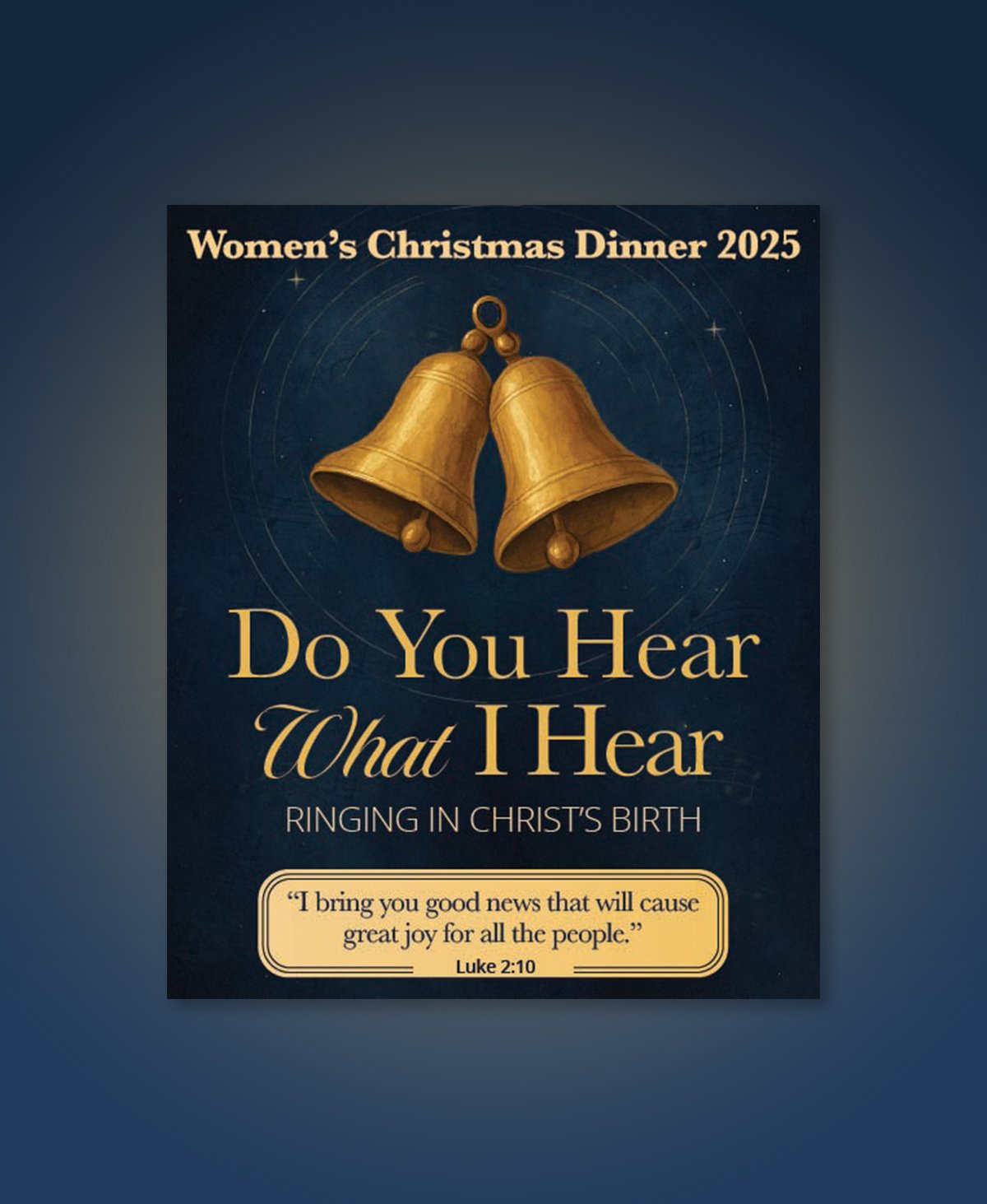
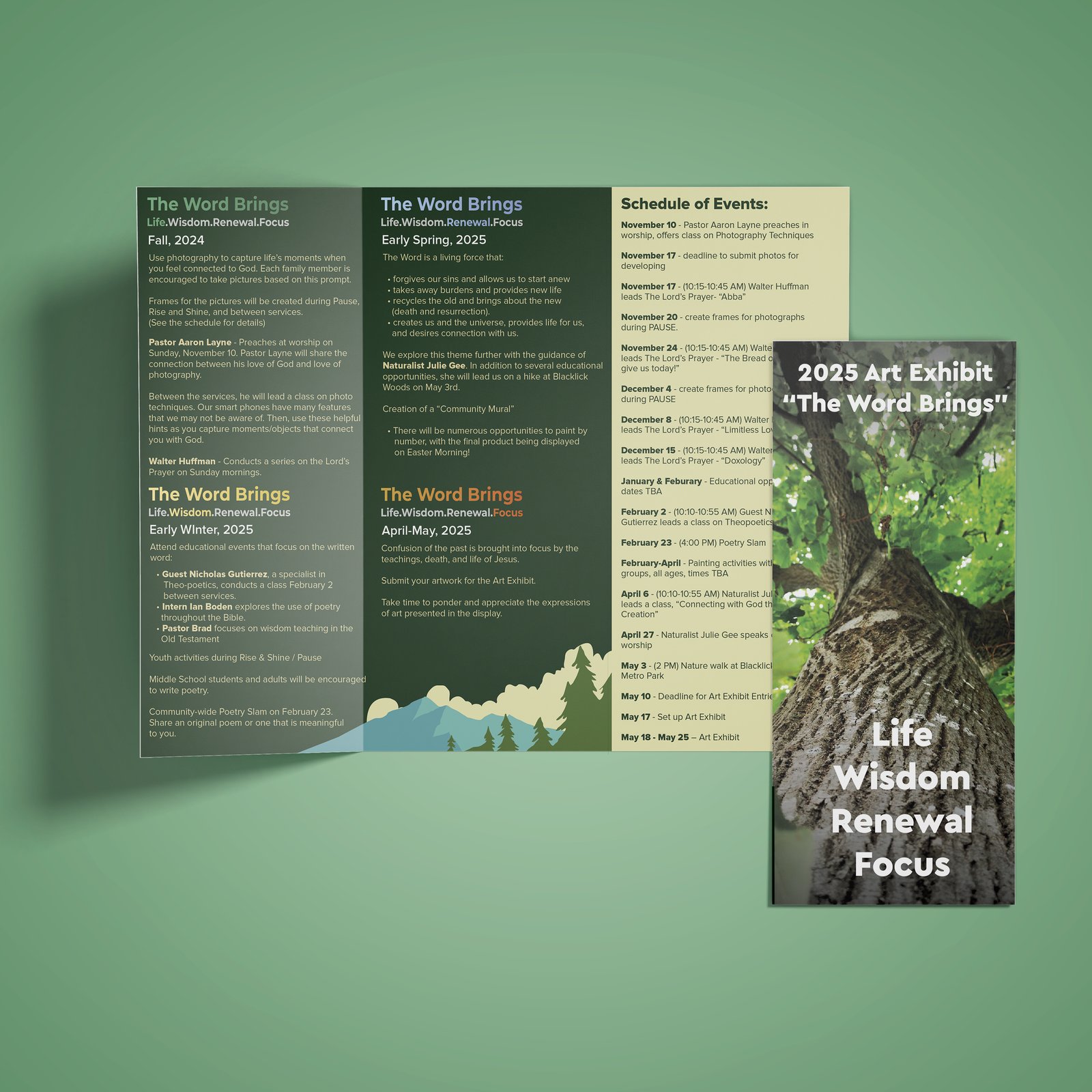
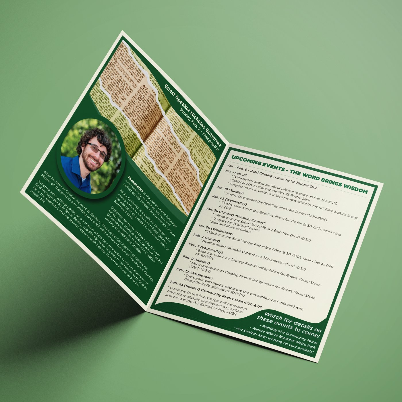
Epiphany Lutheran Church has been an ongoing design client since 2023, with work spanning two distinct project types: the annual Women's Christmas Dinner — a ticketed evening event for 80+ attendees — and the 2024–2025 Art Series, a multi-event educational program that required a tri-fold brochure and bifold promotional flyer.
The Women's Christmas Dinner is the centerpiece: three consecutive years of print suites, each with a unique visual identity while maintaining the feel of a known, recurring event. The challenge is designing something fresh enough to market the current year while consistent enough that returning attendees immediately recognize it as the same event. Each year's suite delivers a print-ready flyer, bulletin insert, and admission ticket on deadline.
The inaugural year established the event's visual language — formal serif typography, a deep navy ground, and gold accents echoing the church's existing brand colors. The nativity silhouette became the central visual anchor.


Year two shifted toward warmth — an amber and cream palette that distinguished it clearly from 2023 while still reading as the same event family. The candlelit intimacy carried across all three formats.


The 2025 suite returned to navy — the same foundation as year one — but with a more contemporary layout and illustrated gold bells that gave the event a visual signature stronger than any previous year. "Do You Hear What I Hear" anchored the theme.


Season-level program materials for Epiphany's Art Series — designed to live within the church's broader brand while serving a distinct audience and purpose from the WCD. The Art Series needed to stand apart visually from the dinner (a different format, a different audience, and a different goal: multi-event program awareness vs. single-event ticket sales). The tri-fold handles the full season calendar; the bifold promotes individual events as they approach.


Any designer can produce one good flyer. Sustaining a recurring client across three years — evolving the look each season while keeping the event instantly recognizable, and delivering print-ready files on deadline every time — is what a client relationship actually looks like. This is retention, range, and reliability in one project.
Event identities that evolve season to season while staying recognizable — delivered print-ready, on deadline.
Start a project →