Print-ready, script-driven InDesign templates for a German fantasy trading card game: a shared material finish, two card orientations, foil separations, and a documented interface the client's own database fills without hand layout.
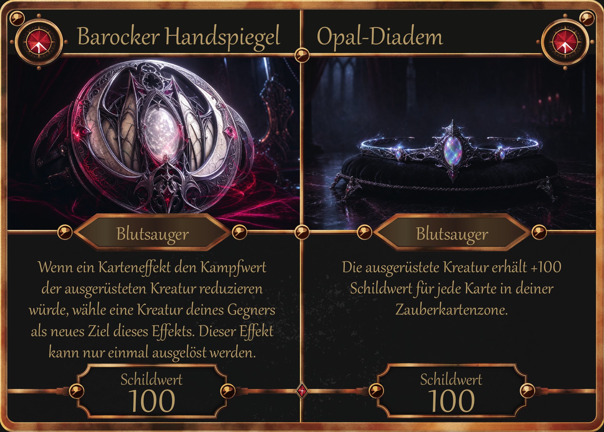
A populated horizontal Defender Creature card. Frame, finish, typography and production files are mine; card artwork and game text are supplied by the client.
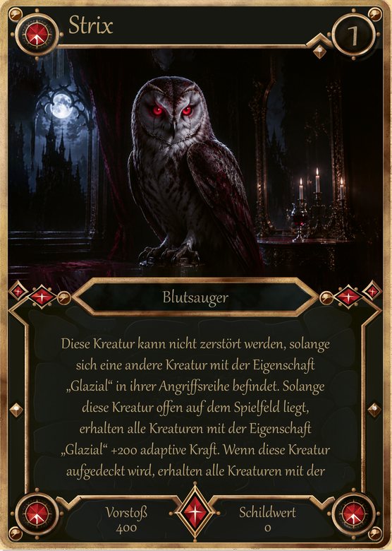
A card game doesn't need seven card designs. It needs one system that can print hundreds of cards, in seven variations, without anyone laying out a card by hand.
The client is building the game's production pipeline himself: a database of cards, exported as data, merged into InDesign and output as print files. My job was everything on the template side of that line — the frame designs and finish, the print specification, and a stable, documented interface his scripts could rely on.
Scope note: card illustrations and game text are supplied by the client. The frames, finish, layouts, swatch system, templates and print files are my work. Shown with the client's permission; no source files are shared.
Every stage ended with written sign-off. Locking decisions in order is what let the final production build happen without reopening a single design question.
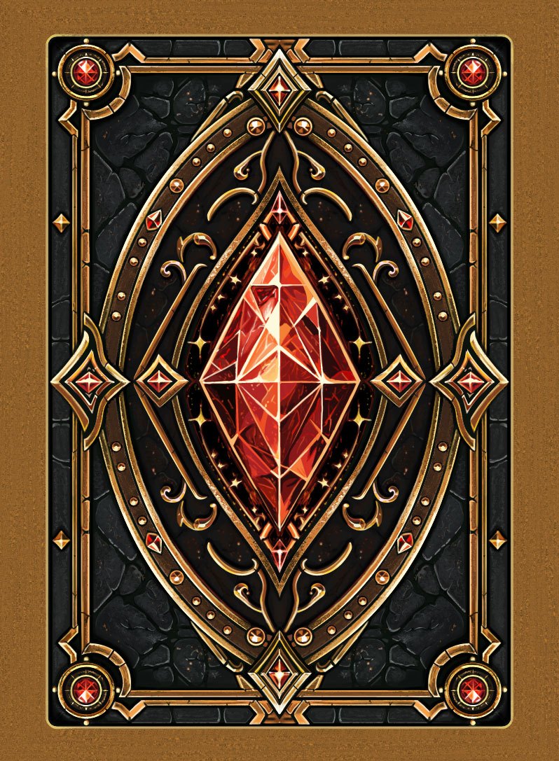
The client chose aged bronze from three studies (aged bronze, weathered copper, dark patina). The approved seven-step ramp then stayed fixed across every card type. Depth came from shading and occlusion layers rather than heavier ink, so even the darkest contact shadow sits comfortably under the press limit.
Total ink per ramp step, with bars scaled to the 300% press limit. Swatches are screen approximations of the CMYK values.
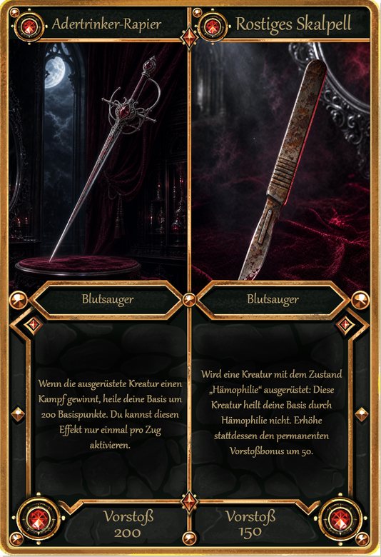
Attack Creature, split Attack Equipment, Spell and Retaliation share a single frame build. A structured swatch system keeps it that way: FRM swatches carry the frame colour and change per card type (bronze, blue, crimson), while ORN ornaments, GEM gems and NEU dark neutrals stay fixed. A recolour is one edit, not a hunt through the artwork.


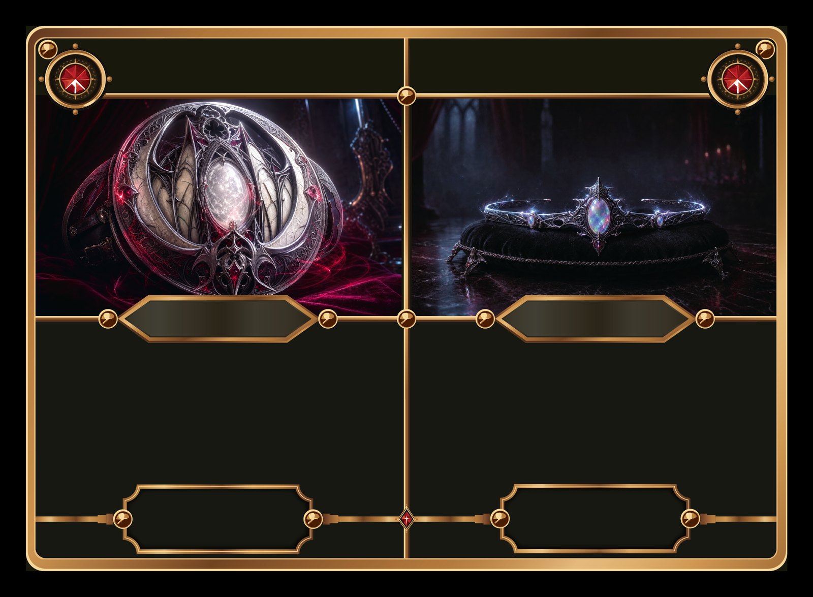
Defender Creature, Base and split Defender Equipment needed new horizontal layouts. I presented two directions; the panorama layout won because it keeps about 72% of a 16:9 illustration as a clear window. Every title, value and label was tested against the client's longest real names and rules texts before approval.


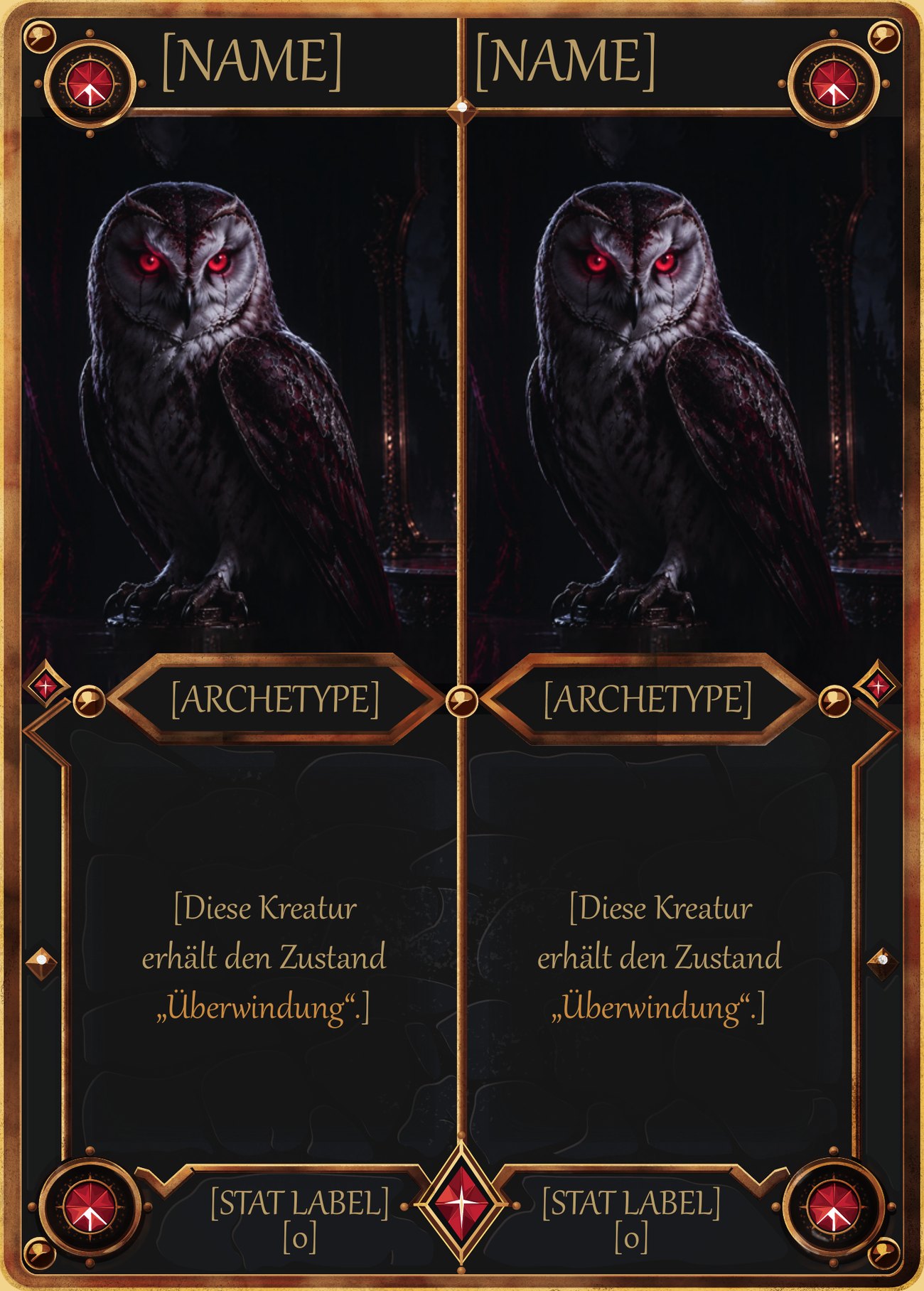
This is what makes it a system rather than a set of designs. Every field has a stable script label, fixed geometry and a defined paragraph style, and the written specification documents normal and minimum type sizes and the practical maximum length per field — so the client knows what will fit before he exports a single card.

| Script label | Controls |
|---|---|
IMG_ARTWORK _LEFT / _RIGHT | Artwork frames, fill proportionally |
TXT_CARD_NAME _BASE / _FOIL | Title twice: ink plate and foil plate |
TXT_LEVEL · TXT_ARCHETYPE | Level badge and archetype plate |
TXT_RULES | Rules text, normal and minimum size |
TXT_STAT _LABEL / _VALUE | Value housings; labels live, not baked in |
TXT_COST _AMOUNT / _TYPE | Two-line cost field on Spell and Retaliation |
The metal finish is driven by masks. My first masks were built by colour selection, and an audit against the vector frame showed they missed parts of the medallions and rails, so those areas were getting no finish at all. Rebuilding the mask directly from the vector geometry covered 76% more of the frame, before anything reached a proof.


Why this matters for hire: a card frame that looks right on screen is the easy part. The value is in files that separate correctly at press, a finish that stays inside the ink limit, and templates that keep working when someone else's data and artwork go into them.
Card templates and frames, material finish, foil and spot separations, and print-ready files your manufacturer can run without rework.
Start a project →