Case Study · Direct Mail & Print Production

Nine19 Direct — 6×11 Direct Mail Campaign

A direct mail consultancy's first campaign piece, designed end to end — offer strategy, creative direction, and press files built around USPS automation rules and signed off by the mail house as good for printing.

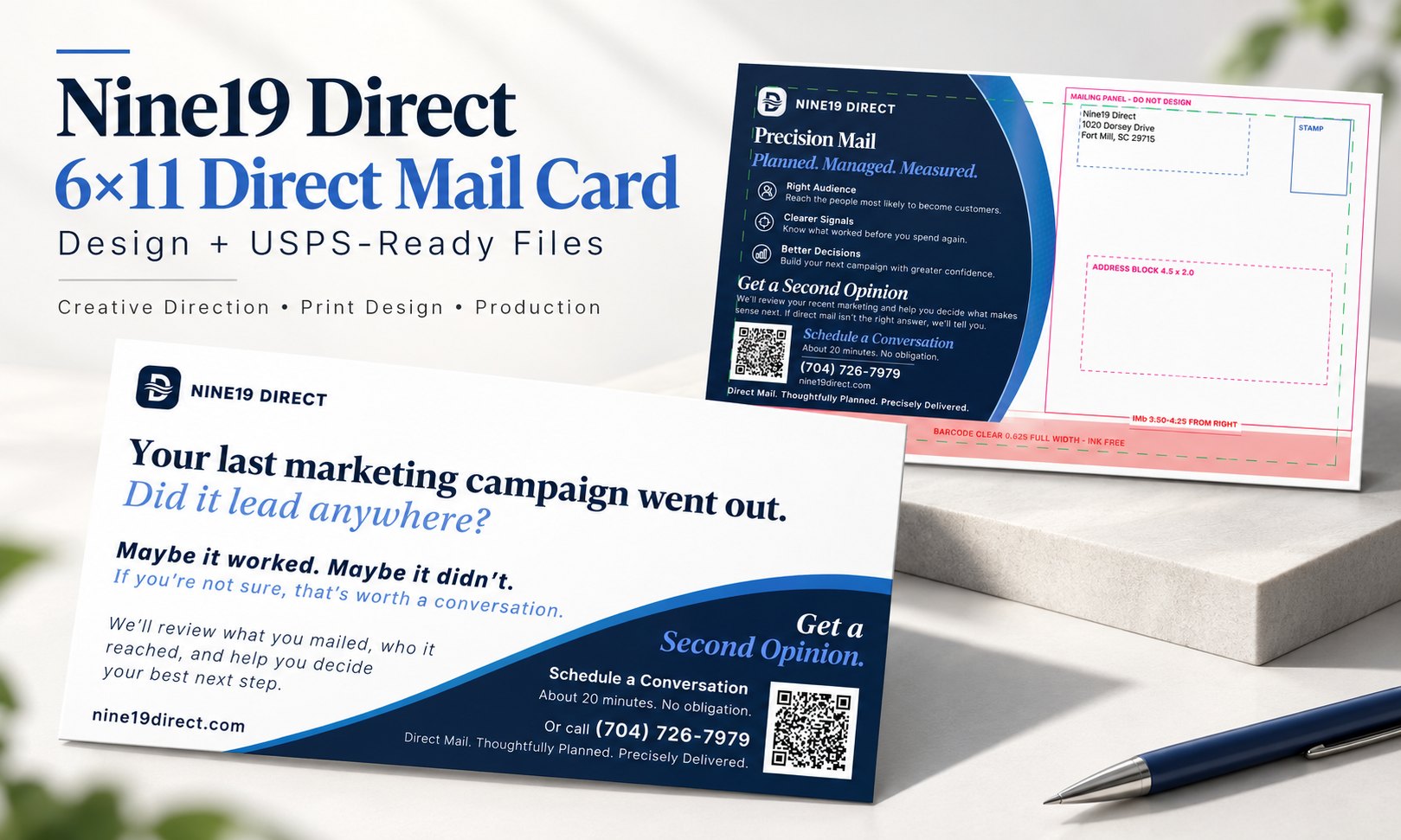
The Nine19 Direct 6 by 11 inch mail card, message side and address side, showing the Second Opinion offer and the Precision Mail benefit panel

Both sides of the finished 6×11 card. The message side carries a single question and one offer; the address side sells the process while leaving the regulated mailing panel completely clear.

Client
Nine19 Direct (Fort Mill, SC)
My Role
Creative direction, design & print production
Scope
6×11 two-sided mail card, pilot campaign
Tools
Illustrator · Photoshop · Acrobat Pro

Direct mail is the one print format that gets graded twice — once by the person who opens the mailbox, and once by the USPS automation equipment that has to read it first. Fail the second test and the campaign doesn't get cheaper postage; it may not get delivered at all.

Nine19 Direct is a direct mail consultancy building a premium customer-acquisition practice. The founder brought me on as creative partner to design the company's first campaign piece: a 6×11 card that would prove out his entire process — design, print, postage, USPS — before he put it in front of paying customers.

He gave me final creative authority on the piece and introduced me directly to the printer so I could resolve production questions without a middleman.

Earn a conversation, don't close a sale

The creative constraints were unusually sharp, and they were the right ones:

That last constraint is the tension worth naming: a mailer that is too restrained stops looking like mail and starts looking like a business card. The piece had to be quiet in its claims and loud in its craft.

Five directions, one selected

Rather than present a single comp, I built five structural directions — different ways the brand's wave motif, panel geometry, and type hierarchy could carry a long horizontal format. Each one is a different answer to the same question: where does the eye land first on an 11-inch-wide card that arrives face up?

Five layout directions for the Nine19 Direct mail card shown side by side, exploring different arrangements of the brand wave motif, panel geometry, and type hierarchy
Directions A through E. The client selected B — the cleanest diagonal split, with the most room for a single dominant headline. The rest were built to make that choice an informed one rather than a default.

One question, one offer

The headline asks something the recipient can't answer, which is exactly the point: Your last marketing campaign went out. Did it lead anywhere? Most small business owners genuinely don't know. The subhead grants permission — maybe it worked, maybe it didn't — and the offer follows as the obvious next step rather than a pitch.

Typographically the card runs on two voices: a serif for the questions and the offer, a grotesque for everything procedural. That split lets the diagonal navy panel carry the entire call to action without competing with the headline above it.

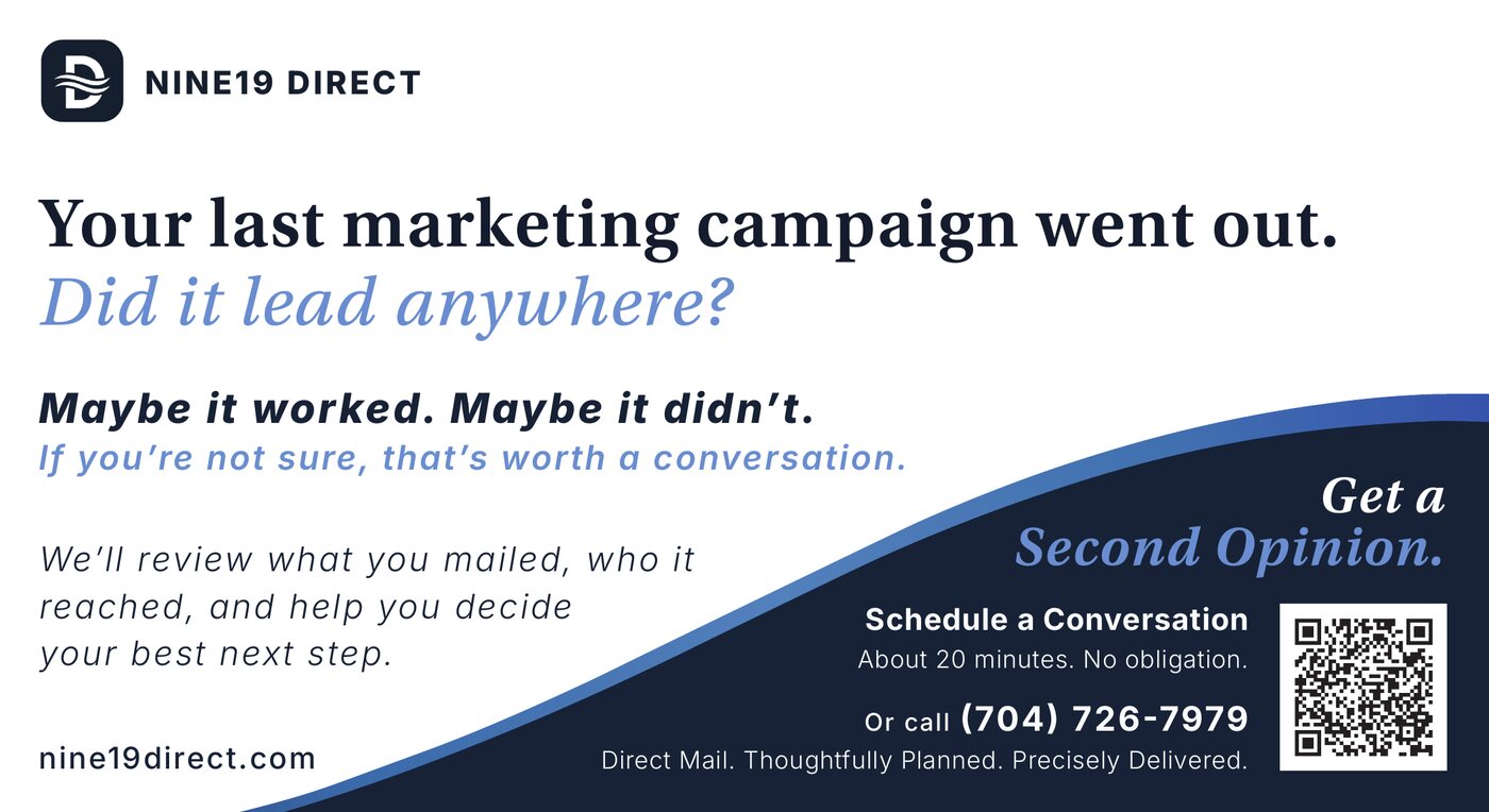
The message side of the Nine19 Direct 6 by 11 card — headline question, permission-granting subhead, and a navy diagonal panel carrying the Second Opinion offer, QR code and phone number
Message side. Everything below the diagonal is the offer; everything above it is the reason to care.
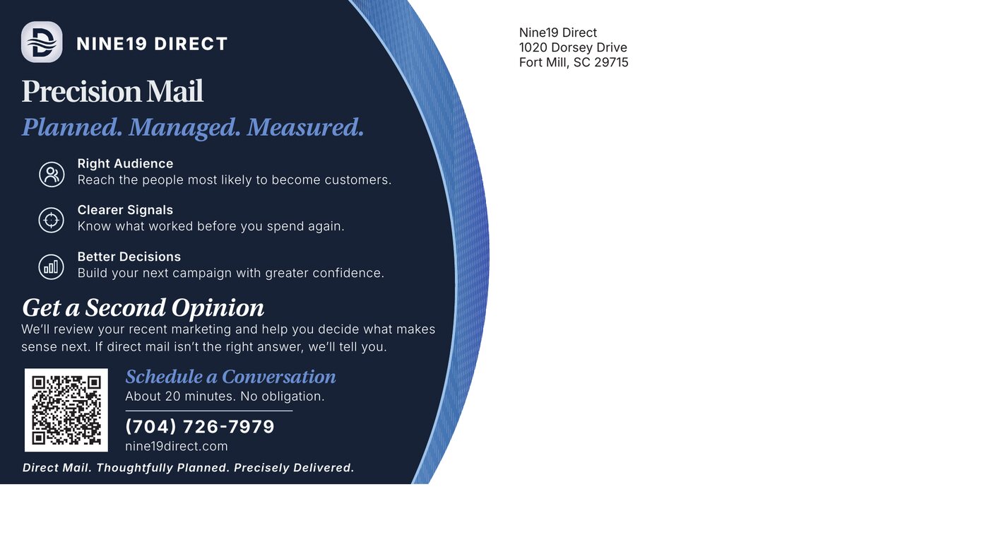
The address side of the Nine19 Direct card — a Precision Mail benefit panel on the left half, with the right half left entirely clear for the mailing panel
Address side. The benefit panel earns its keep on the left half while the right half stays completely clear for addressing.
Both sides of the finished Nine19 Direct card shown as printed pieces — the message side in front, and the address side behind it with the mailing panel, address block, and barcode clear zone marked
Both sides as printed pieces, with the address side's production marks visible.
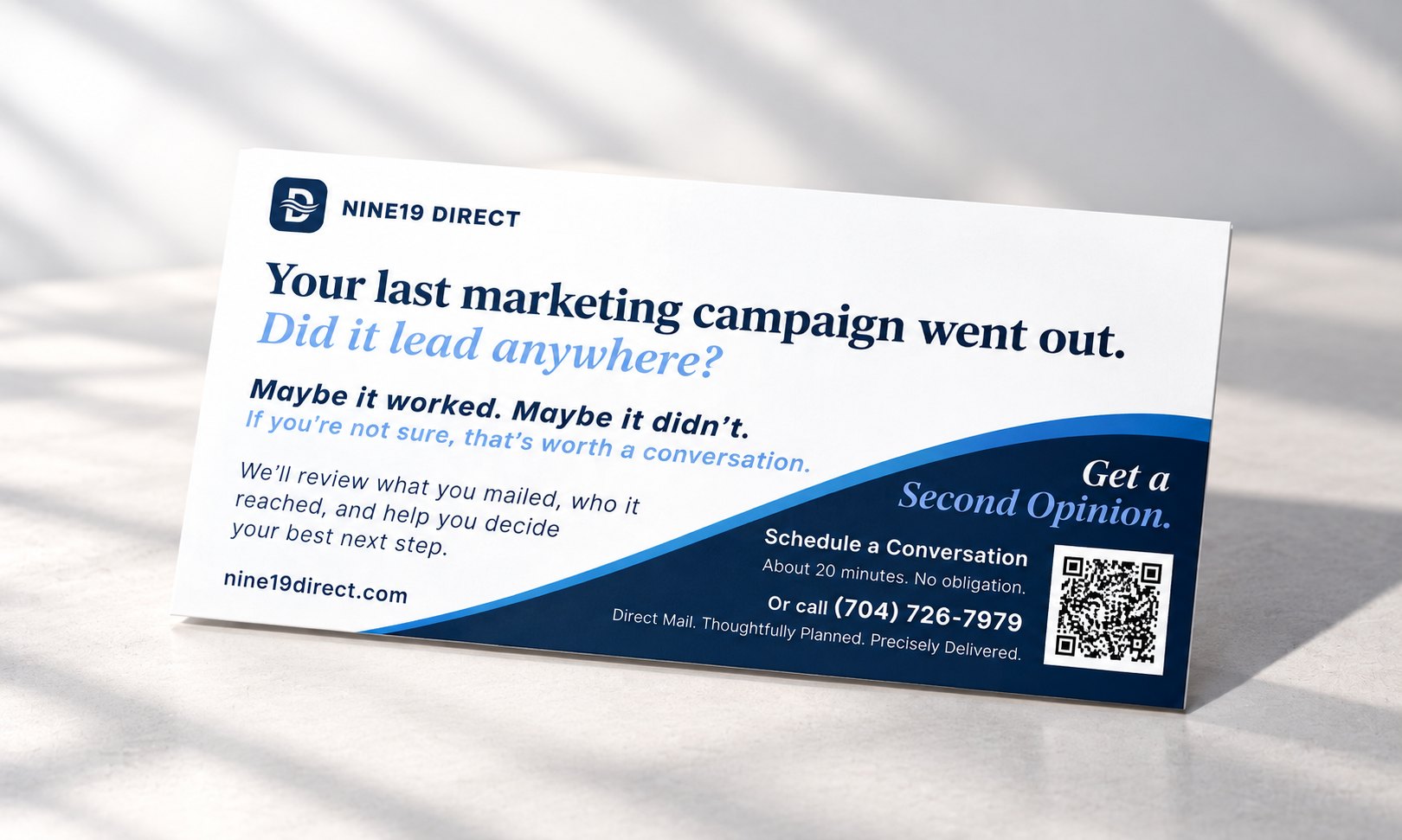
The message side of the Nine19 Direct card standing on a tabletop in soft window light
The message side as it arrives: one question, one offer.

The regulated half of the card

On a self-mailer, roughly half the address side isn't design space at all — it belongs to the Postal Service. Getting that wrong is not a proof revision; it's a rejected mailing or a surcharge applied to every piece in the drop.

I built the address side around those zones from the first layout rather than retrofitting them at the end, and marked them explicitly on the proof so the client, the printer, and the mail house were all reading the same file.

The marked production proof of the address side, showing the mailing panel boundary, the 4.5 by 2 inch address block, Intelligent Mail barcode placement, and the full-width ink-free barcode clear zone
The marked proof. Mailing panel boundary, 4.5×2.0 address block, Intelligent Mail barcode placement 3.50–4.25 inches from the right edge, and a full-width 0.625-inch clear zone that must stay entirely free of ink.
11 × 6 in
Two artboards, 0.125" bleed and 0.125" safe area on both sides
CMYK
U.S. Web Coated (SWOP) v2 throughout — no RGB to be re-ripped at the press
12pt C2S
Coated two sides, 4/4, digital press

The package shipped as three exports rather than one: a live-text press PDF, a fully outlined version, and a marked proof for review. When the client later compared a second printer whose intake tool wanted separate faces, the same file produced split front and back PDFs without a rebuild.

Why three exports: live text lets a printer's prepress department fix a last-minute typo without coming back to me. Outlined type guarantees the letterforms survive an unknown RIP. The marked proof keeps the specs visible to everyone reviewing. Sending only one of the three is how a job ends up being reset by someone who has never seen the brand.

Signed off for print

The mail house signed off on the file as good for printing. The card became the client's first end-to-end validation of his process — design through print, postage, and delivery — and the layout logic was scoped to be adapted into a size family so future customer jobs could be turned around in hours instead of days.

“Josh is a systems thinker and connects the dots really well. I really enjoyed working with him.”

— David Gunter, President, Nine19 Direct · 5.0 ★ Upwork engagement

Why this matters for hire: direct mail is where design meets a regulator. The piece has to persuade a skeptical reader, survive a digital press, and satisfy USPS automation rules — and the designer is usually the only person in the chain who touches all three. This project is that whole loop in one artifact.

Planning a direct mail campaign?

Offer strategy, creative direction, and press files built to clear USPS automation the first time — designed and production-prepped together.

Start a project →
← Back to all work