Case Study · Historical Illustration & Colour

Meyer 1570 — Historical Woodcut Colorization

A plate from a 1570 fencing treatise, hand-colorized in Photoshop for UV printing — no AI colorization, with the original block-cut hatching reading through every garment.

Detail of the colorized 1570 Meyer fencing plate — three swordsmen in red, black and blue mid-exchange in a colonnaded hall, with spectators dining behind them

The finished plate. Every colour sits beneath the line work rather than over it, so the engraver's hatching still does the shading it was cut to do.

Client
Christian Darce
My Role
Colour restoration & print preparation
Source
Joachim Meyer, 1570 — public domain
Tools
Photoshop · Acrobat Pro

The client was unusually direct about what he didn't want.

“I have a historical graphic. I need the colors enhanced for UV printing. I can do this with AI, but I don't want that.”

That single sentence is the whole project. A generative model will produce a colorized version of this plate in seconds, and it will look plausible until you examine it — at which point the hatching has been smoothed into gradients, the sixteenth-century palette has drifted toward something contemporary, and small details have been quietly invented where the original was ambiguous. For a piece being printed and sold as a historical object, invented detail is a defect.

The source is a plate from Joachim Meyer's 1570 fencing treatise, one of the most significant surviving manuals of the German longsword tradition. It's in the public domain, and the surviving hand-coloured impressions have faded unevenly over four and a half centuries.

Restored, not reimagined

The goal was to bring the plate back to the saturation it would have had when the colour was fresh, without changing a single decision the original colourist made. Every garment keeps its assigned hue. The blue swordsman stays blue; the tan doublet stays tan. What changes is density, separation, and the recovery of colour that had gone chalky.

The 1570 Meyer plate before and after colorization, side by side — the faded original at left, the restored version at right with recovered saturation and separation
Left: the original faded plate. Right: the finished file. Same composition, same colour assignments, same paper tone — recovered density and restored separation between adjacent garments.

Colour underneath, line work on top

The whole approach rests on one structural decision: the original scan's line work stays on its own layer at the top of the stack, and every colour layer sits beneath it set to Multiply. Nothing is painted over the block-cut lines. That single constraint is what separates restoration from repainting, because it makes it physically impossible to bury the woodcut under colour.

From there it's masking, garment by garment. Each doublet, hose, sleeve, column, and floor tile gets its own mask, because adjacent areas in the original had drifted toward each other and needed to be separated by hand rather than by a global adjustment. A hue-shift across the whole image would have moved the paper tone with it.

The aged paper was deliberately retained. Bleaching the ground to white is the fastest way to make a four-hundred-year-old print look like a modern reproduction of one.

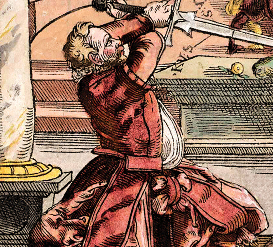
Detail crop of the red-clad swordsman at left — the engraver's parallel hatching visible through the red of the doublet and hose
The hatching still reads through the red. The shading is the block cut's, not a soft brush's.
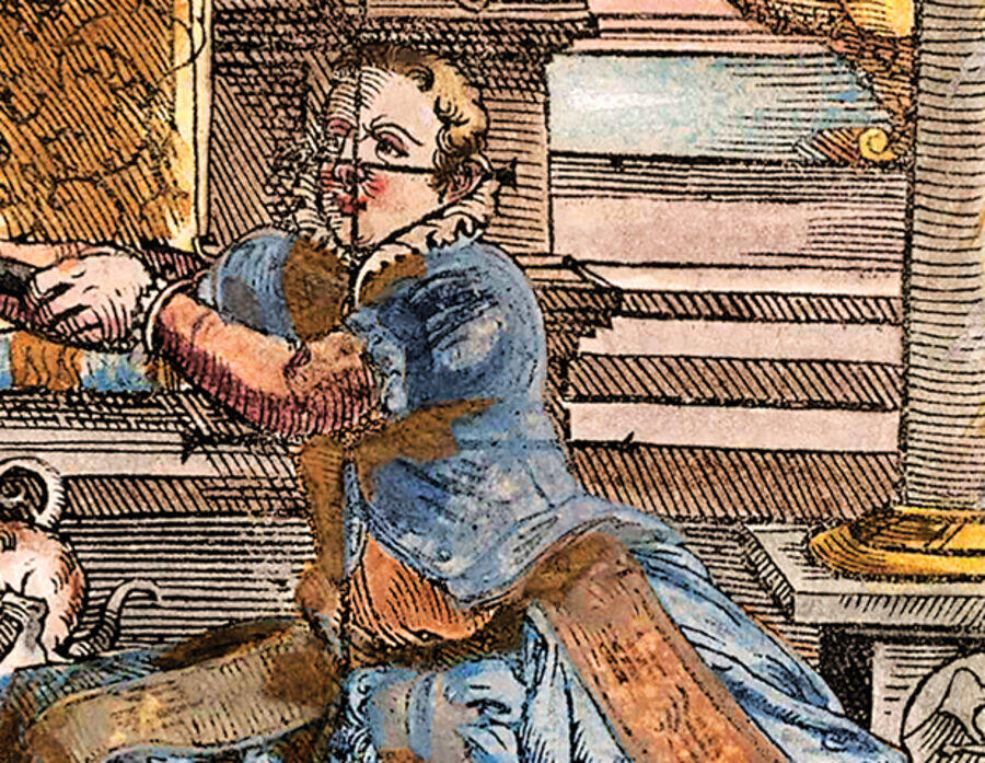
Detail crop of the blue-clad swordsman at right — layered blue and tan with the ruff and facial line work preserved
Adjacent blue and tan separated by mask rather than by a global hue shift, so neither drags the other.

On AI, since it's the reason this job existed: I use AI for research and writing. I don't use it to make artwork, and I didn't use it here — not for colorization, not for upscaling, not for filling detail. Everything in this file came from the original scan plus masked, hand-placed colour.

Prepared for UV, not for a screen

The file was destined for UV printing on a physical product, which changes what “enhanced colour” is allowed to mean. UV inks lay down dense and can gain noticeably on the substrate, so the deep reds and blacks that look correct on a calibrated monitor will close up and lose the hatching they were carefully built to preserve.

So the density in the darkest garments was pulled back from where it looked best on screen, deliberately, so the printed piece would land where the screen version already was. The paper tone was held warm rather than neutral for the same reason — UV white is brighter than the eye expects and pushes everything else cooler by comparison.

Multiply
Every colour layer beneath a preserved line-art layer
Per-element masks
Garments, architecture and floor separated individually
UV-aware
Shadow density held back for ink gain on substrate

A historical object, still

Read at full size, the test is whether anything looks added. The spectators at the banquet table, the drummer on the stair, the dog beneath the crossed blades, the lettering ghosted through from the reverse of the leaf — all of it is the 1570 impression. Only the colour is new, and only where colour had been before.

The complete colorized 1570 Meyer fencing plate — three swordsmen in a colonnaded hall with spectators at a banquet table behind, restored to full saturation
The delivered file. Show-through lettering from the reverse of the original leaf was kept rather than cleaned away — it's evidence of the object, not damage to it.

Approved through every proof stage

The client reviewed at each proof stage and approved the final for production. He knew his print specs, which made the UV conversation short and precise — the sort of engagement where the constraint is stated once and both sides design to it.

Where this leads: this is the kind of work I want more of — historical and editorial illustration for publishing, where accuracy to a source matters as much as craft. I hold a history degree alongside the design one, which is genuinely useful when a project's real requirement is knowing what not to change.

Have historical artwork that needs to print?

Colour restoration, editorial and historical illustration, and substrate-aware print preparation — hand-worked, never generated.

Start a project →
← Back to all work