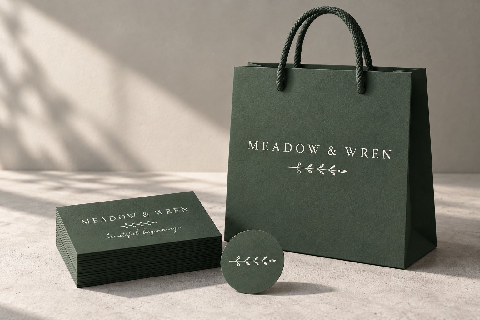
A brand that existed only as raster images inside product mockups, rebuilt as a nine-variant vector suite with hand-traced script, Pantone matching for fabric, and every file a manufacturer would ask for.
The full primary lockup: wordmark, sprig, and tagline. Every curve here is a drawn path, and the script is traced letterform by letterform rather than set in a typeface.
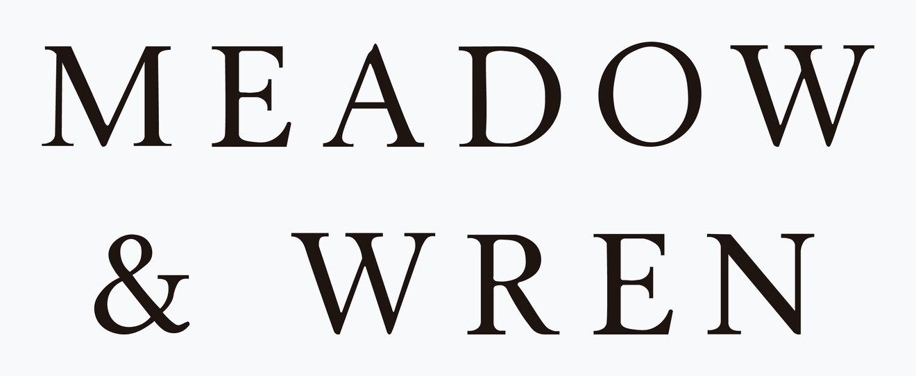
A logo that only exists as a picture of a logo isn't a logo yet. It can't be enlarged, separated, embroidered, foil-stamped, or matched to a thread colour — and every one of those is something a small brand eventually needs on a week's notice.
Meadow & Wren came to me with concepts they loved that existed only as raster images embedded inside product mockups. They were explicit that they did not want new design work: they wanted the mark they had already chosen, faithfully redrawn and locked into production-ready files for packaging, fabric tags, and print.
Scope note: the source concepts were AI-generated before I was engaged, and the brief was faithful redraw and cleanup rather than original design. The redrawing, the curve work, the script tracing, and the colour system are mine; the concept direction is theirs.
Running raster art through an auto-trace produces something that looks approximately right at thumbnail size and falls apart everywhere else. Curves acquire dozens of unnecessary anchor points, stems wobble by a fraction of a millimetre, counters fill with stray fragments, and the resulting paths are effectively uneditable — you can't adjust a stroke weight or a letter spacing without fighting the geometry.
Worse, it bakes in whatever compression noise was in the source. On a mark this delicate — a high-contrast serif with hairline strokes and a script tagline — the noise is the letterform at the thin points.
So the marks were redrawn: consistent stem widths, deliberate anchor placement at curve extremes, closed counters, and terminals that match each other across the whole alphabet rather than each inheriting its own accident.
A single lockup fails the moment it meets a shape it wasn't drawn for. A stacked mark drowns on a wide fabric tag; a wide mark shrinks to illegibility in a square avatar. Three configurations cover almost every real application, and the sprig standing alone gives the brand a small mark for seals, favicons, and stamps.


Full colour is what a brand wants. Solid black and solid white are what production actually asks for — single-colour embroidery, foil, letterpress, engraving, a dark-background application, a fax of a purchase order. Delivering all three at the outset means the client never has to come back and ask for a knockout version at five o'clock on a Friday.
The script in the tagline is not a typeface. It was traced by hand from the source art, which means it can't be reproduced by installing a font — and it also means nobody can accidentally reset it in a near-miss lookalike and quietly break the brand.
Hand-traced script carries one production risk worth naming up front: the hairline connectors between letters get very thin at small sizes, and below a certain scale they will drop out on fabric or fill in on absorbent stock. That warning shipped with the files rather than being discovered later.
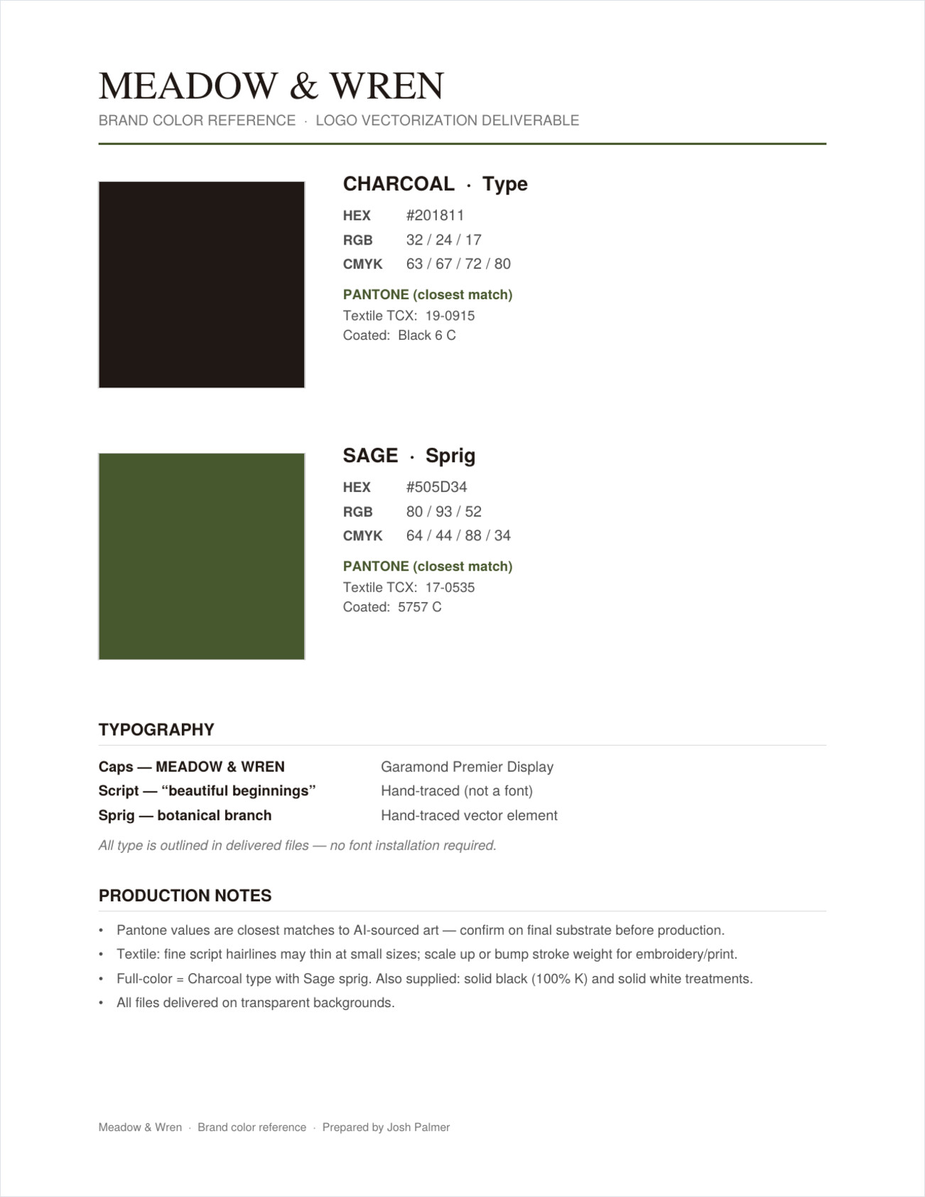
A vector file answers “what shape.” It doesn't answer “what green,” and that's the question a fabric mill, a packaging converter, and a printer will each ask separately. So the suite shipped with a one-page reference giving both brand colours in HEX, RGB, and CMYK, with closest Pantone Coated and Pantone Textile TCX matches called out — the TCX values specifically because fabric tags don't match to a coated ink book.

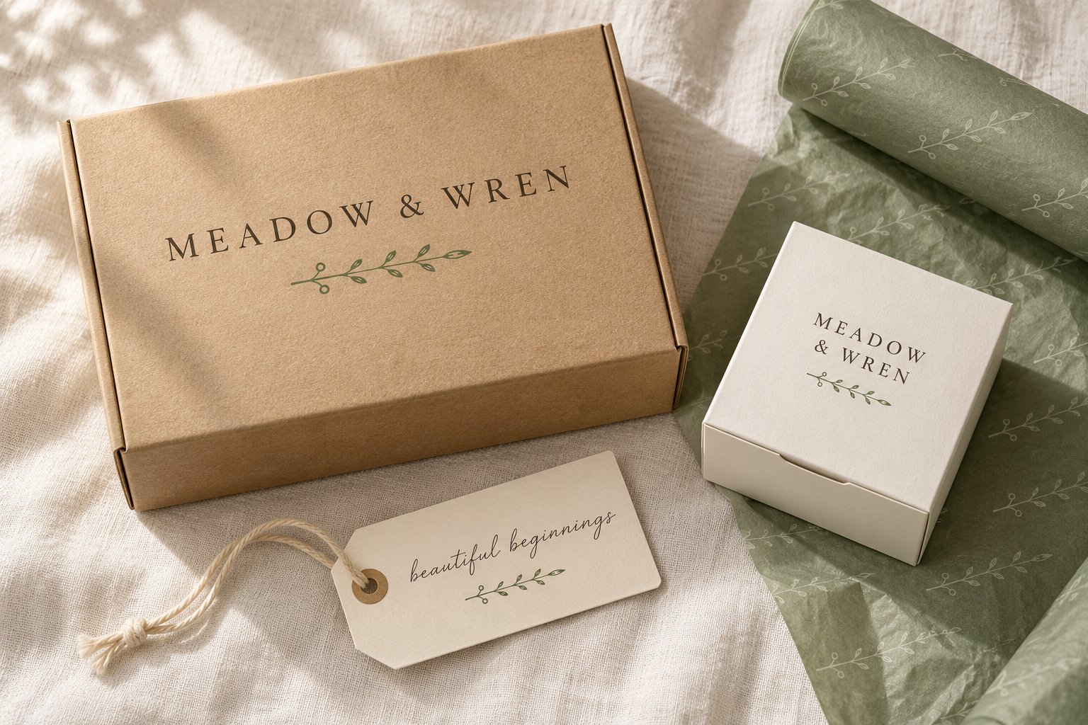
The test of a production suite is whether each variant drops onto a real surface without adjustment. These mockups use the delivered files as-is: the horizontal lockup on a shipping box and a shopping bag, the stacked lockup on a woven label and swing tag, the sprig alone as a seal, and the white knockout on dark stock.


The folder structure matters more than it sounds like it should. A client who receives thirty-six files in one directory will email you every time they need one. A client who receives them sorted by colourway and format finds the right file themselves, two years later, without you.
— Meadow & Wren · 5.0 ★ Upwork engagement
Why this matters for hire: vectorization looks like a commodity task and isn't. The deliverable is not a vector file — it's a brand that can be manufactured by people who will never speak to the designer, in formats and colour systems they already use.
Faithful redraw, full variant and colourway system, Pantone matching for print and fabric, and every format a manufacturer will ask for.
Start a project →