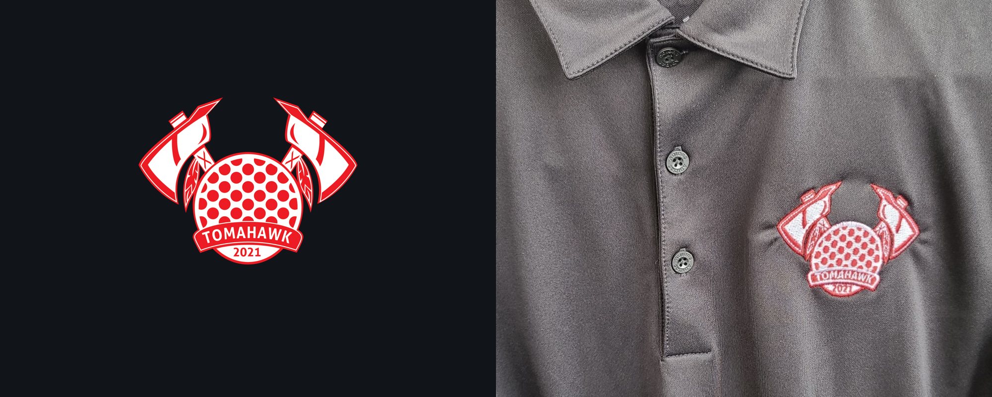
The finished vector mark (left) and the same badge embroidered on a left-chest polo (right).
A body of team and club apparel across sports and community groups — each mark taken the full distance from graphite concept to clean vector to a finished, production-ready garment. One repeatable pipeline, applied to many teams. No AI, no traced stock art.
Team and club apparel looks simple from the outside, but it lives or dies on production discipline. A mark has to survive whatever it's put on — a screen-printed tee, a two-sided club shirt, and the hardest test of all, a small left-chest embroidery where every stitch counts. Across Team Tomahawk, Hydra Aquatics, the Raiders, Animal Kids Camp, and the F.O.R. Club, I ran the same repeatable process: originate by hand, rebuild as clean vector, and prepare the file for the exact way it will be produced.
Because the process repeats, the case study below walks the full arc on one anchor project — Team Tomahawk's sketch-to-stitch embroidery — then shows the range of work the same pipeline produced. A logo destined for thread or a spot-color press can't lean on gradients, fine hairlines, or tight interior detail that turns to mush at scale, so I design backward from the constraint: bold shapes, deliberate negative space, and confident color that reads cleanly whether printed or stitched.
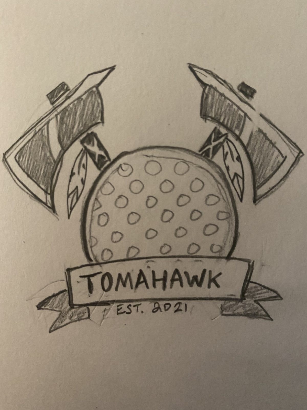
Every element started on paper. I want clients to see the work is genuinely originated by hand, so the arc below is the real one — pencil concept, clean vector translation, then a digitized embroidery proven on an actual garment. This is the pipeline every project on this page runs through.
Crossed tomahawks framing a central crest, a feather hanging from each handle, and a banner anchoring the team name and year. Working in graphite first let me lock composition, silhouette, and balance before committing a single vector point.
This sketch is the proof of process: fully hand-drawn, no AI, no auto-trace.
I rebuilt the sketch as true vector paths in Illustrator — redrawn, not auto-traced — so the axe edges, feather lines, and banner curves were intentional and scalable. The interior detail was simplified just enough to keep the mark legible when it shrinks to chest size.
A single red on white keeps the badge bold across print, signage, and stitch.
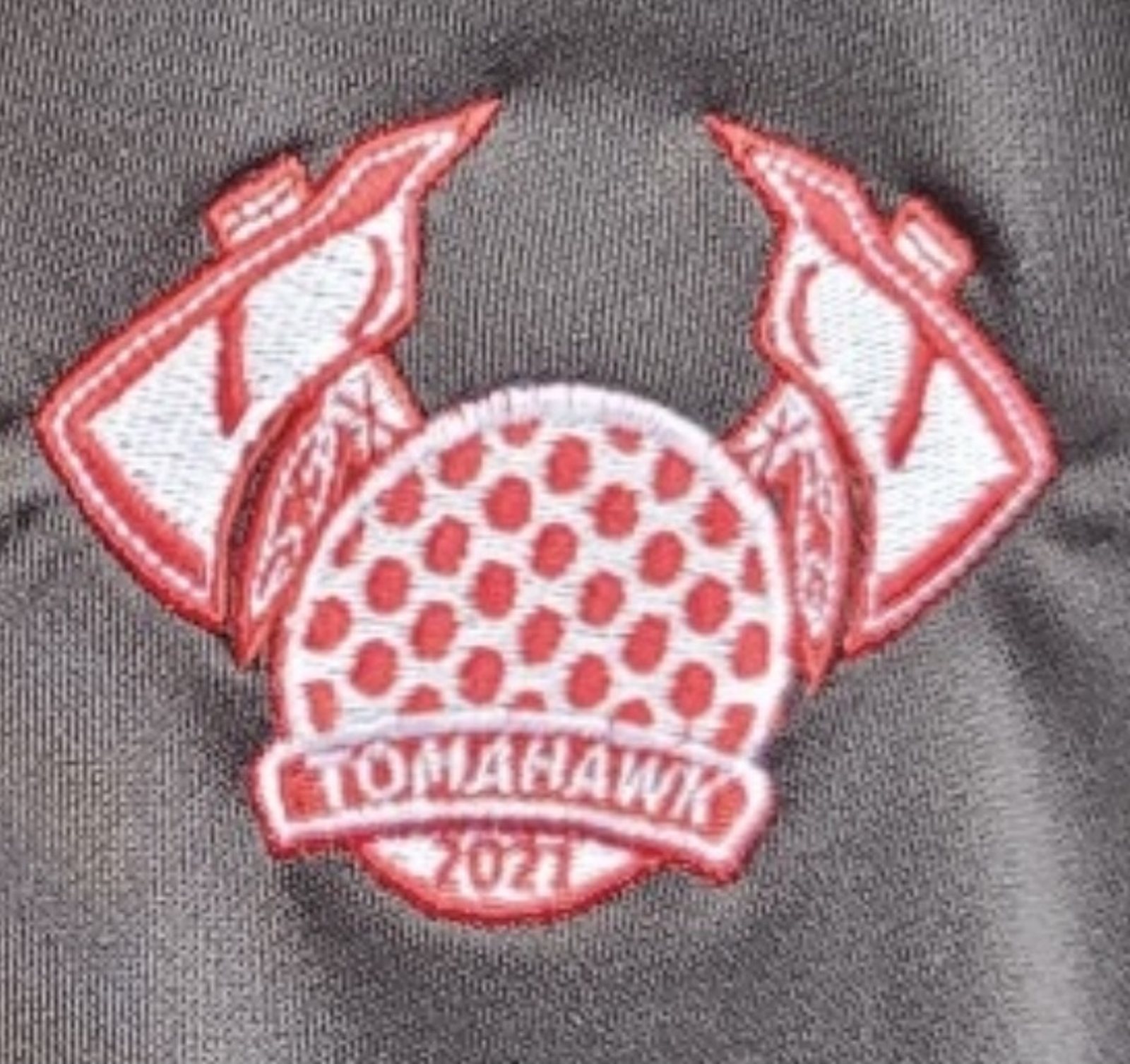
The vector was digitized into an embroidery file — stitch directions, fills, and a tight outline tuned so the small interior dots and banner lettering would hold at left-chest scale. This is where production knowledge earns its keep: a design that ignores stitch density simply fails on the machine.
The detail shot shows the finished stitch-out — clean satin edges, readable banner, and the dimpled ball rendered as discrete fills rather than fine line work.
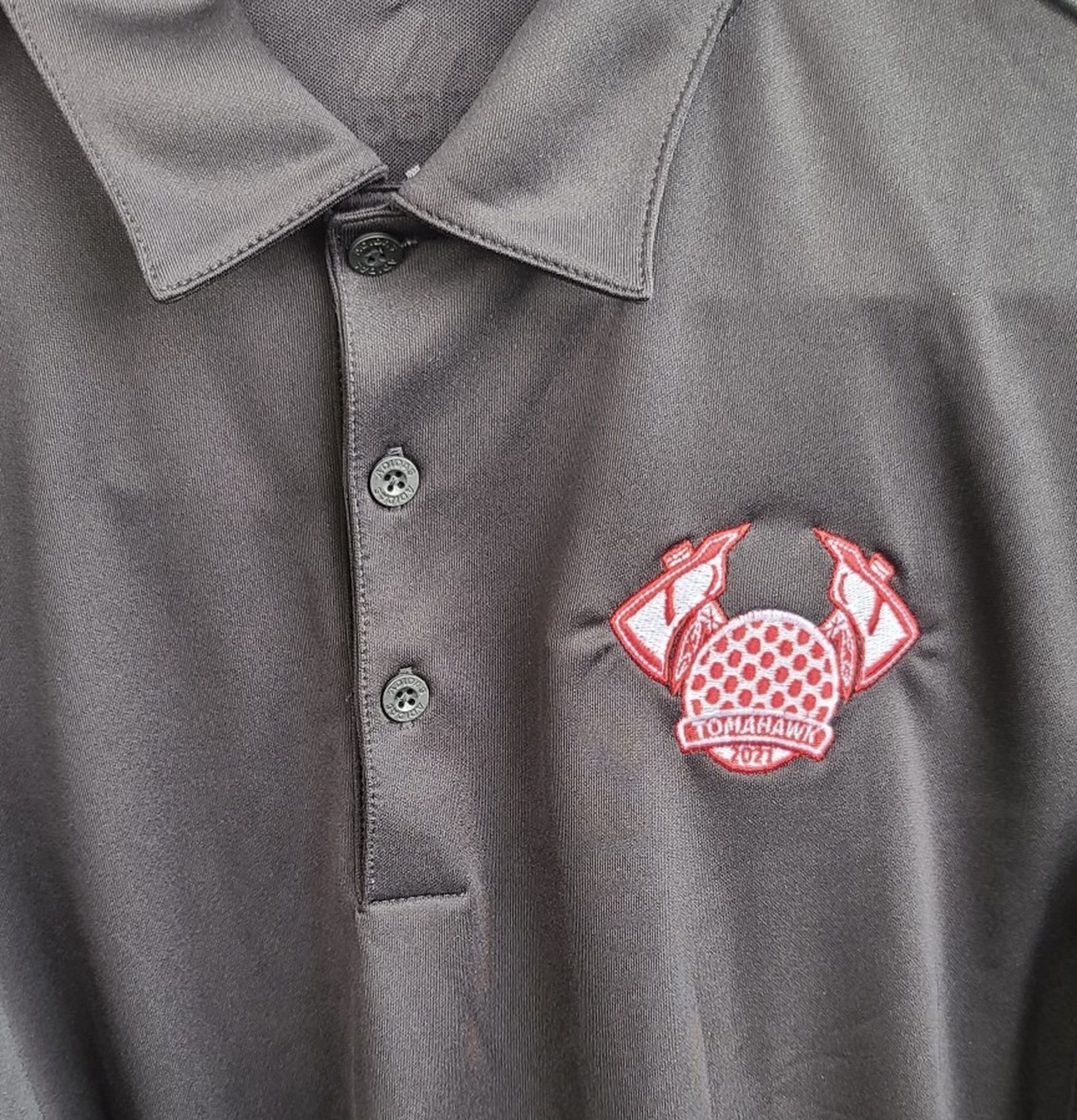
The final test: the badge stitched onto a charcoal performance polo as a left-chest crest. It reads instantly at arm's length, holds its shape against the fabric, and keeps the personality of the original pencil sketch all the way through to thread.
Different sports, different tones, one consistent standard for production. Each of these started as original artwork and was prepared for the exact process — screen print, two-sided print, or embroidery — it would be produced on.
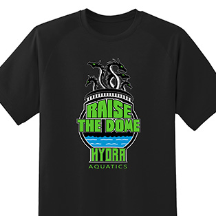
A bold "Raise the Dome" swim-team tee — high-contrast lettering and mark built for a clean spot-color screen print.
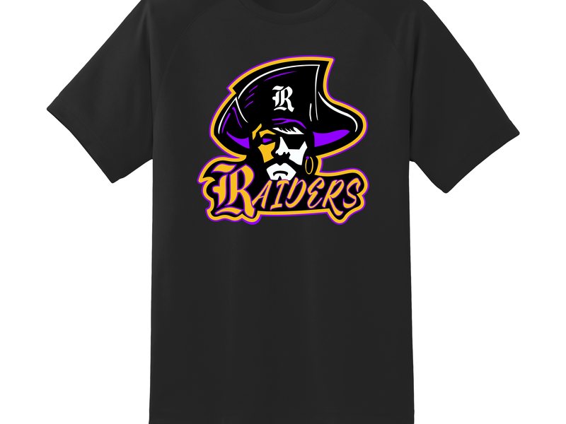
A rugged team mark set on black — heavy, legible artwork designed to hold up as a single-color garment print.
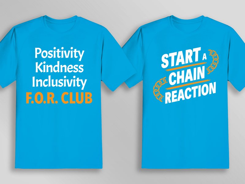
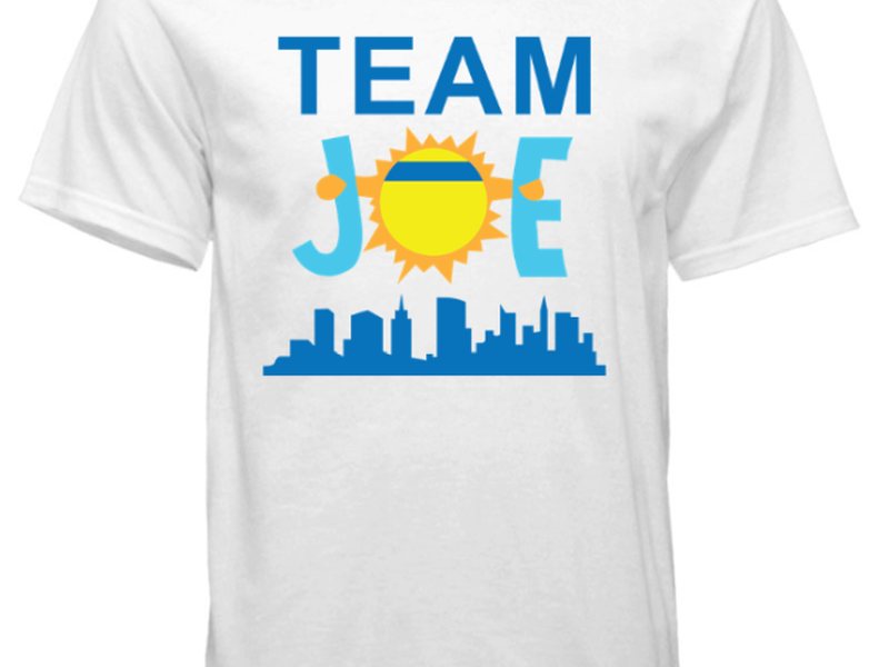
One idea across two sides — positivity, kindness, inclusivity on the front; a chain-link "Start a Chain Reaction" callout on the back. Typographic and screen-ready.
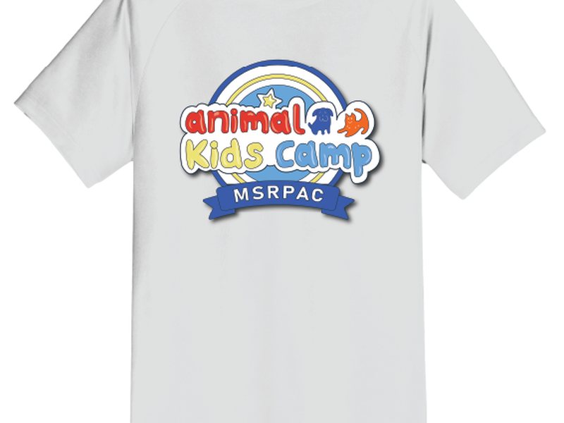
A friendly illustrated camp tee — hand-drawn character work simplified into a print-ready, kid-appropriate design.
A community support shirt built around a single rallying mark — simple, warm, and easy to reproduce at volume.
The anchor project above — the crossed-axe crest digitized and stitched as a left-chest embroidery on a performance polo.
Across every team on this page, the artwork went from a hand-drawn concept to a finished garment without losing its character — exactly the result a team wants when their logo will live on apparel for years. Beyond any single deliverable, this body of work demonstrates a pipeline most digital designers can't show: original illustration carried through clean vector and into real-world screen-print and embroidered production, matched to how each piece is actually made.
I design marks the way this one was made — sketched by hand, built as clean vector, and prepared for the format they'll actually live on, from print to embroidery.
Start a project